
Over the last few weekends, Nike has been previewing their latest attempt to “improve” athletic apparel on several premiere NCAA Division I (yeah, that’s what I still call it) football programs. Now, perhaps these uniforms, designed to be ultra light and form fitting, are functionally a worthy advance, but from a sartorial viewpoint, well, my inner Tim Gunn was making this face. A lot.

A brief survey of some of Nike’s designs after the jump.
 Ohio State’s aren’t bad up close (though I’m not feeling the white helmet, “retro” or not), but did no one from Nike’s design team notice that from far away — you know, like in a 50,000 seat stadium — the pant stripes look pink? And what’s with the weird sock striping?
As we’ll see, Nike really wants teams to wear white helmets, but the “noteworthy” design element here is the weird scribble things on the shoulder pads. I can’t decide if they represent wings or chalk marks coaches might make for blocking drills.

Here’s a helmet that’s not white! It’s black …on black (matte black/dark gray, same difference). Again, might have been a good idea to check the look of these from the top of the stadium, Nike. Even on my parents’ giant HDTV the helmets looked blank whenever the camera zoomed out to show a play in progress.
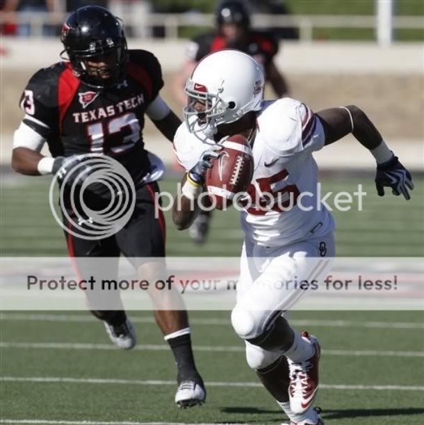
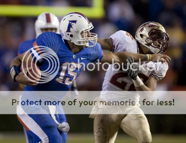
Attention Nike: The Sooners are crimson and cream. In that order. Not CREAM and (crimson). I want my red helmets (and the interlocking OU) back, dammit! We are not the red state version of Penn State. I will admit to kind of liking the pants. Kind of.

These I don’t really mind. Probably because I’m not a fan of Virginia Tech’s color scheme anyway, and the white is more soothing to my eyeballs.
I know there were other teams with new unis (LSU and Texas among them), but this is enough, don’t you think?

I like those Oregon white jerseys with the silver numbers. I can’t explain it, but I’m also sold on Oregon’s duck wings on the shoulders. At least ducks have wings! Plus the white on white names were pretty cool.
Usually I’m a stickler for plain, basic unis. But Oregon somehow won me over with the way they looked against ‘Zona.
I hated Oregon’s “steel plate” shoulders that they used to have. It looked so out of place on the unis. Oregon usually has pretty weird uniforms considering Nike is their neighbor and they test everything out on them first.